CALM MY CHAOS APP 2018
UX/UI Designer, Art Direction + Brand and Product Management
ABOUT CALM MY CHAOS
Why am I creating this App?
Calm My Chaos is dedicated to health and mental awareness. It uses artificial intelligence to sort through images, sound and text relevant to the person using the app as well as encouraging the use of pre-recorded audio affirmations and actual breathing exercises. It also uses a gamified element to visually help to encourage participation and commitment.
As a brand specialist, UX/UI and creative strategist, I've had the privilege to tell various stories graphically, through writing and via audio for many different clients/industries. In addition to my work which I am passionate about, I'm thrilled to see how my interest in emotional well being will translate across technology. Knowing what to look for and how to THINK like a UX designer gives meaning, depth and resonance to every project regardless of medium.
"Suffering gives meaning only when one is able to recognize a need for change and transformation in oneself first then in others. Our journeys whether easy or challenging are never meant to be experienced for our benefit alone"
INTRODUCING CALM MY CHAOS - A MINIMUM VIABLE PRODUCT
Anxiety/Depression are mental health conditions that have increased in severity in today's society. "According to Statistics Canada, 23 per cent of people over the age of 15 report that most days are “quite a bit” or “extremely” stressful, and that number rises to 30 per cent among the 35 to 54 age group. There are many reasons why our levels of stress have increased. ex. Changes in job-related requirements, chronic pain, pressures revolving around the need to fit in, the need to take care of other members in our family/circle as well as exterior environmental/political/world calamities. When unchecked, stress can lead to many other conditions such as PTSD, high blood pressure and heart condition.
CALM MY CHAOS is an app that I designed in order to encourage mindfulness and offer the general user a way to deal with their stress via an AI-based 'buddy system' system. (Artificial Intelligence)
The app contains 5 main areas:
1) Affirmations
2) Image gratification and visual aids
3) Breathing exercises
4) Mindfulness
5) Education (Resources)
1.0 DEFINING THE USERS: (AUDIENCE NEEDS + EMPATHY MAP)
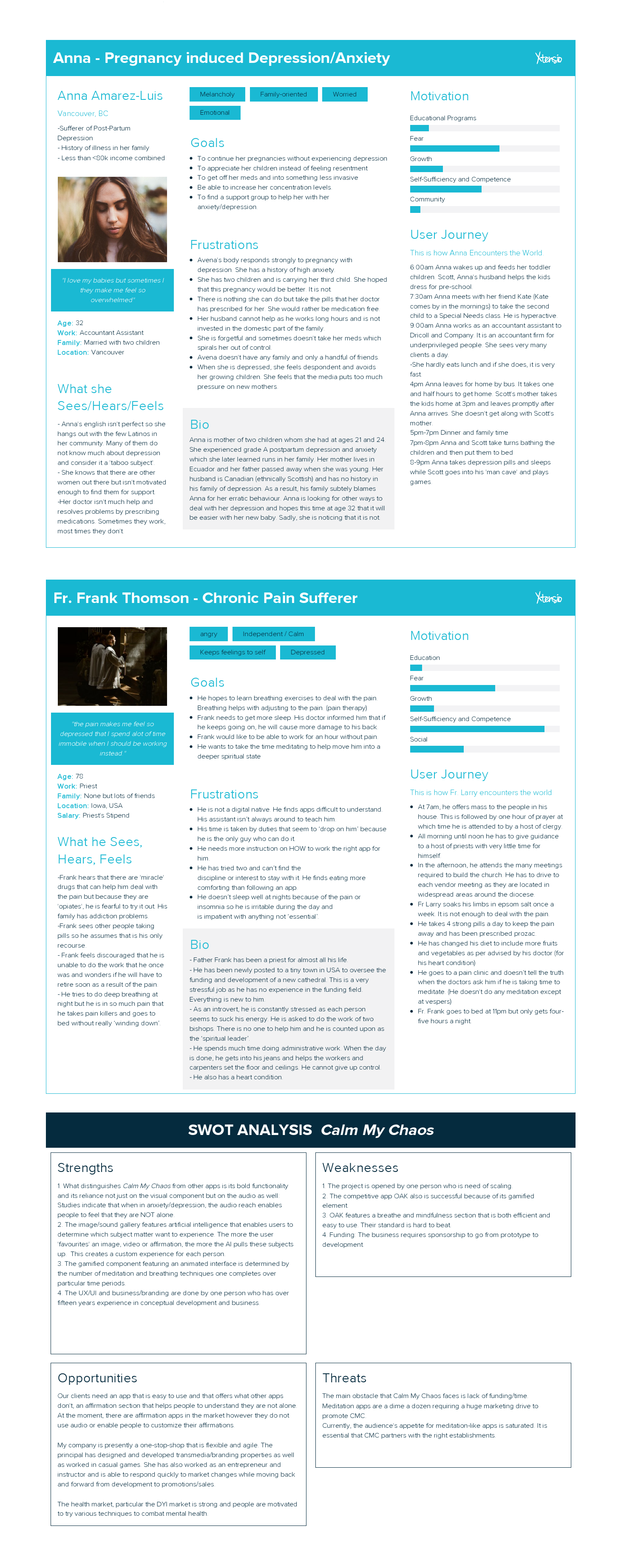
Using the information gathered from user surveys, interviews and discussions, I chose four people out of my initial 25 interviewees whom I felt represented people who could potentially benefit from my app. I asked these people open-ended questions specifically about how they dealt with stress, anxiety, pain and depression. I matched the data with past information, identified the correlations and then probed further in order to determine the mindset, hopes, aspirations, fears and general emotional state of these people. I learned about when, why and how people respond to mental health stresses in addition to what kind of inaccurate beliefs and fearful/shameful thoughts people hold. After creating empathy maps, I combined all the information into Persona Charts.
Here is my list of people:
1) Anna - Post Partum Depression and Anxiety
2) Fr. Frank- Chronic Pain with low energy threshold
3) Richard - Single Father of two children (Overworked + Under-Employed)
4) Josh - Post accident survivor with PTSD and complicated neurosis.
I also created a SWOT Analysis of the product in order to determine if an app of this nature is economically viable.
Some of the third party apps that I used to develop my information include: https://app.xtensio.com and Canva for the User Testing Infographic Chart
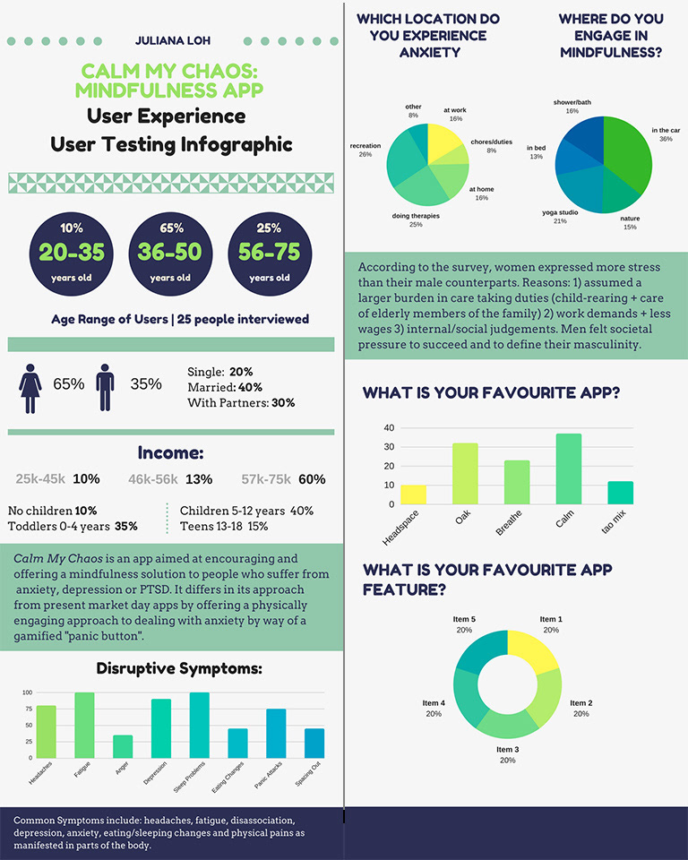
1.02: Interview Results with first 25 people:
1) Favourite Anti-Stress Apps: Oak, Breathe and Headspace
2) General income level: Stress hit all levels for different reasons but was keenly felt by under-employed and under-supported individuals.
3) Cross section of symptoms:
fatigue, disassociation, headaches, pain, lack of sleep, mood swings, despair, rage, confusion, shame, addiction, loss of spiritual selves, denial, physical changes, loss of empathy of compassion for self or others.
2.0. HEURISTIC ANALYSIS (COMPETITIVE ANALYSIS)
After recording observations pointing to what people felt were worthy app components, I completed a heuristic analysis of the top three popular apps: Breathe App, Oak and Headspace.
3 Heuristics Compared:
a. Visibility of System Status: Whether or not the App provided adequate Feedback
b. Match Between System and the Real World: Did the content, language, words used reflect the context of the app?
c. Aesthetic and Minimalist Design: Was the app easy to understand, minimal in use and direction?
From there, I determined what made the apps successful by recording and analyzing the interactivity (patterns) in pen/paper format. When creating anything 'interactive', one does not necessarily have to 'invent the wheel'. True design is independent of ego.
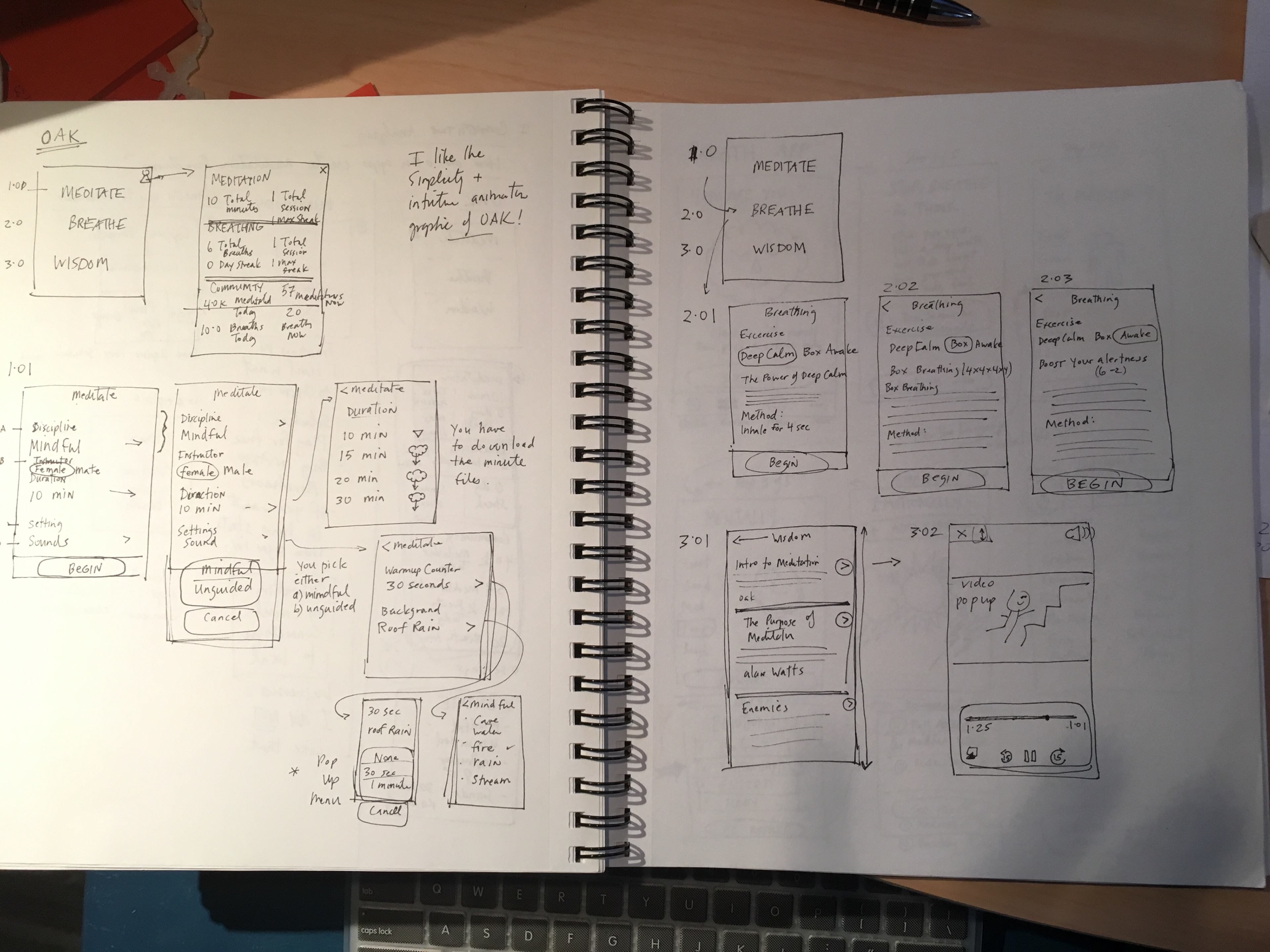
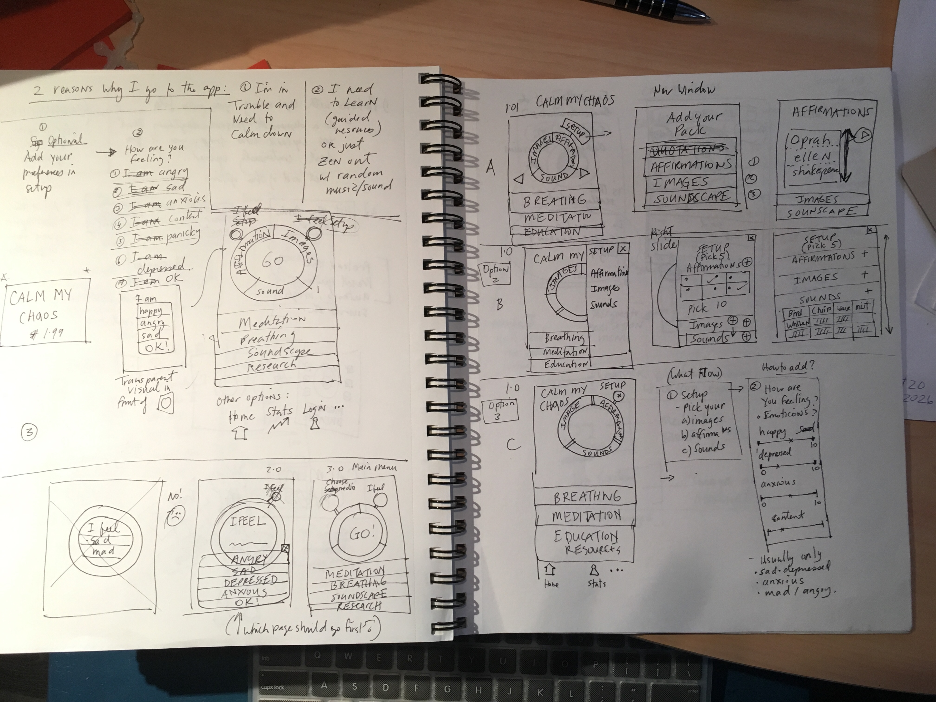
3.0 WIREFRAMING
When I completed the analysis, I discovered that the following items represented a good assortment of what people potentially liked in a new app:
1) Affirmations (Easy to understand, easy to relate to with a recording that gave people the illusion that they were not alone)
2) A gallery of images/sounds (Calming images and sounds all gathered in a library personal to each general user)
3) Breathing Exercises (Quick Techniques with intuitive instructions with the ability to schedule times/dates)
4) Mindfulness Techniques. (Simple mindfulness training with the ability to add reminders to calendars (dates and times)
5) Appendixes that include Records of what activities were done and when. (Times of stress)
This part of the project required time and investigation in order to identify which affordances to implement.
To develop the most effective Minimum Viable Product, I relied on user stories to help define the functionality.
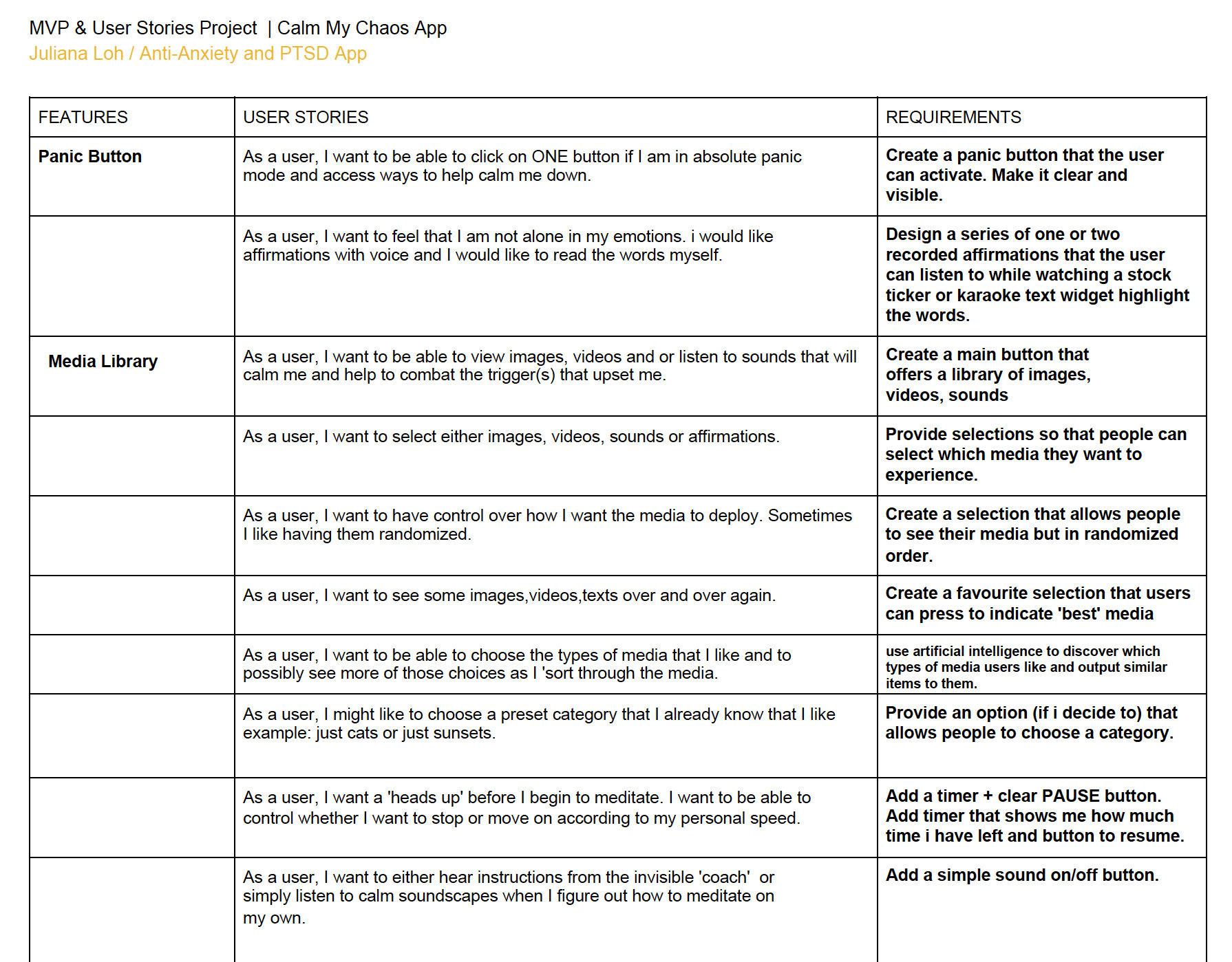
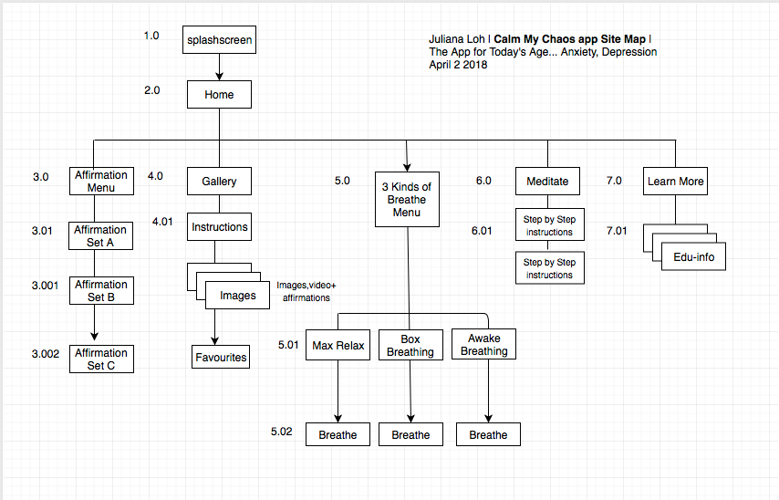
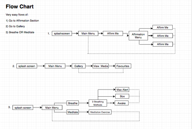
4.0 FLOW CHART + INFORMATION ARCHITECTURE:
Considering each person's behaviour (user flow) also gave me a sense of how to design for each person's need. My goal was to have every person regardless of how they used their app reach their intended directive(s) within three clicks or less.
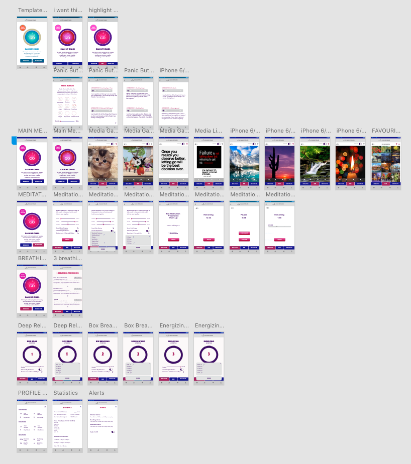
5.0 LOW FIDELITY PROTOTYPES:
The app underwent a slew of different visuals. The obvious challenge with this app was the way in which the mechanics of the IMAGE GALLERY was designed. Since the UI did not follow any particular pattern, I looked toward other interactive models for ideas. For example, the words under the Affirmation section dropped down like ticker tapes on the stock market signs; one word at a time. My mentor likened them to karaoke key word highlights. The point was, exterior information models provided samples for the way visual information was projected.
The first sets were designed with pen and paper while the second sets were created in low fidelity products such as Balsamiq and Adobe XD. The hardest part of this task was to keep the app simple and scalable.
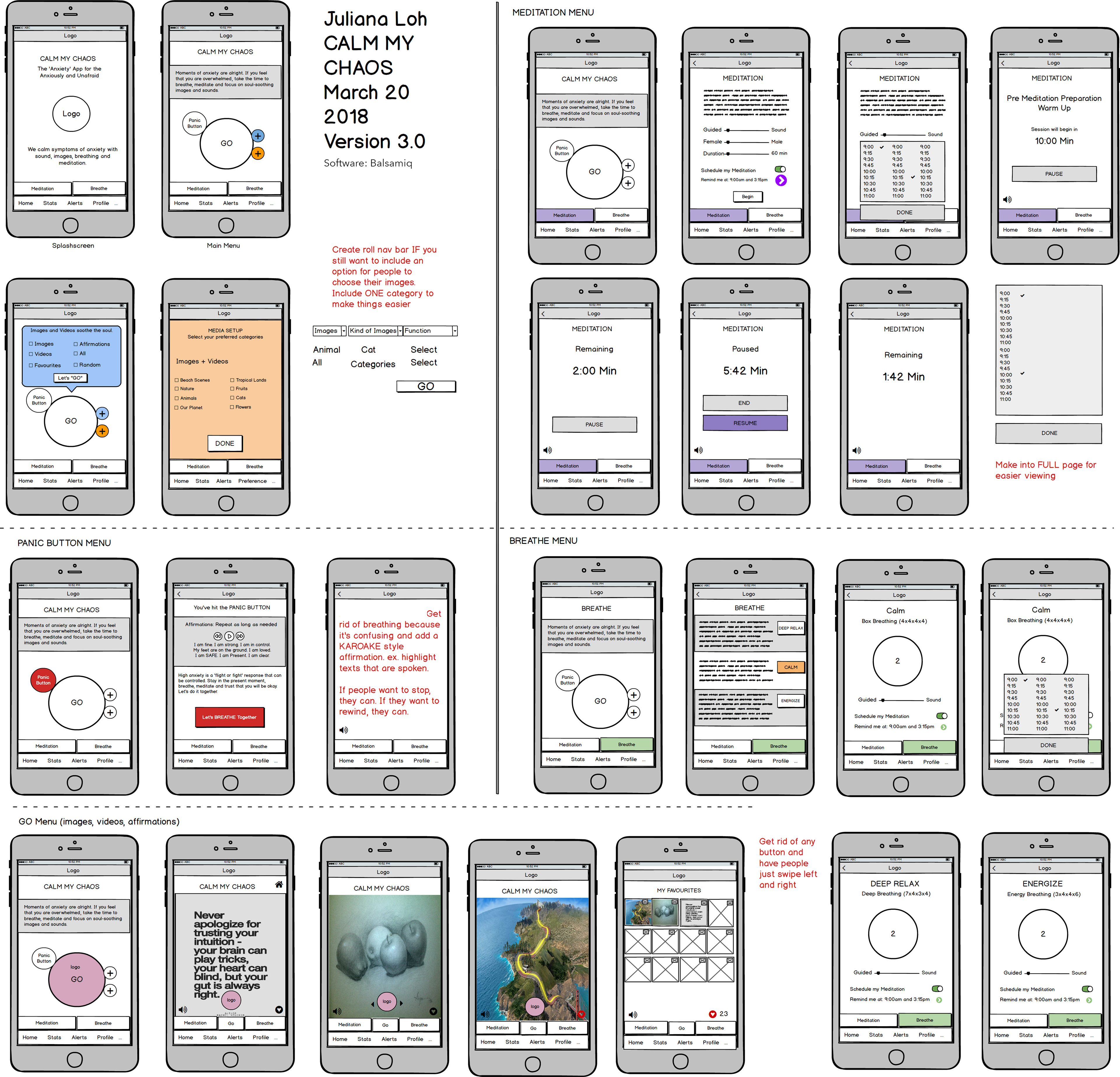
Experimenting with various softwares is a necessary undertaking. Sketch and Invision is the UI standard, however it was important to familiarize oneself with Adobe XD as their product encompasses industry base tool set standards. I found very little ramp up time with this program and would definitely recommend it as a part of your toolkit.
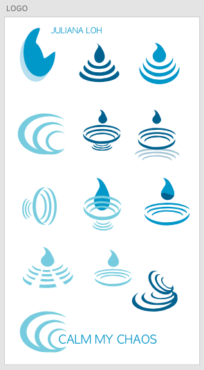
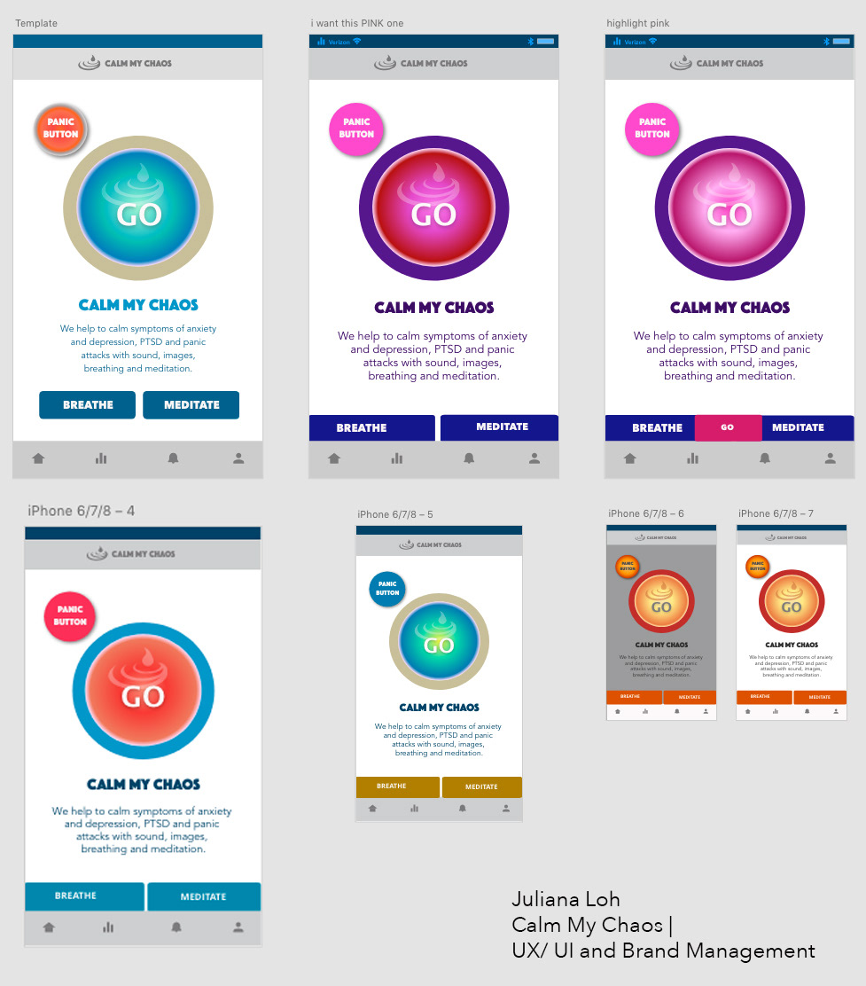
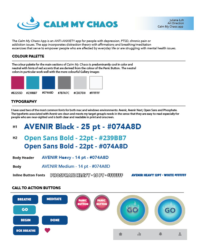
6.0 ART DIRECTION
Logo designs encompassed ripples from waves (acoustic, aquatic etc.) accompanied with a simple modern font. The image was checked in black and white for contrast and fidelity (print). A similar symbol was designed for the iPhone app button. Colors ranged from strong cool tones to warm trendy look and feels.
7.0 USER TESTING OF PROTOTYPE
The SEMI-FINAL VERSION of the art direction and interface changed several times depending on data represented by user research feedback. There was something about the flow of the app that I didn't quite feel hit the mark so I invited my clients to go through the app while I recorded their thoughts.
DISCOVERIES:
1. While creating the prototypes, I discovered that there were problems with the structure of the Main Gallery. Although I had sketched it out and defined a flow in Balsamiq, I wasn’t able to decipher what was really wrong until I user tested it. I had a wonderful mentor to bounce off ideas but he too was unable to solve the problem.
2. What i liked the most about hitting this “hard spot” was the collaborative nature in which my mentor and I worked together. In the end, I finally figured out the solution by myself. It was a huge relief.
8.0 USER TESTING FEEDBACK:
OVERALL EXPERIENCE:
Dominic: I liked it. I thought it was really insightful. I don’t want to read alot of information so this appealed to me. I liked the main content viewer. It’s easy to use. The layout is very nice.
Elaine: Alot of thought was put into it. When will it be sold because I would buy it and i don’t even use apps alot. It is easy to use and nice to look at. I don’t want to scroll through a whole bunch of images just to find the ones i want. I know what i like. Why don't you just let me pick the categories I want?
Jackie: I like it! When are you going to make it? I like the app because it’s just simple and
straightforward. I want to know that i am not alone when i use it. I like the audio recording.
PAIN POINTS:
Dominic:
I like this feature alot but I’m not sure why I am asked to breathe. Perhaps give me some brief but relevant info.
Elaine: SOS - Isn’t this the same thing as the breathing section? Why am i breathing here when there is a breathing section?
Ann:
I like this section but I’m not sure why it says SOS? Maybe “need help now?” or PANIC BUTTON? Didn’t you call it Panic Button before? Yes. I like it but i want it to go straight to the breathing part. I like the affirmations. Do i get to type in new sentences?
9.0 HIGH-FIDELITY ITERATIONS
I finally thought that I had the best design until I looked at the user flow again. After charting it out with several more people, I decided to change the navigation significantly.
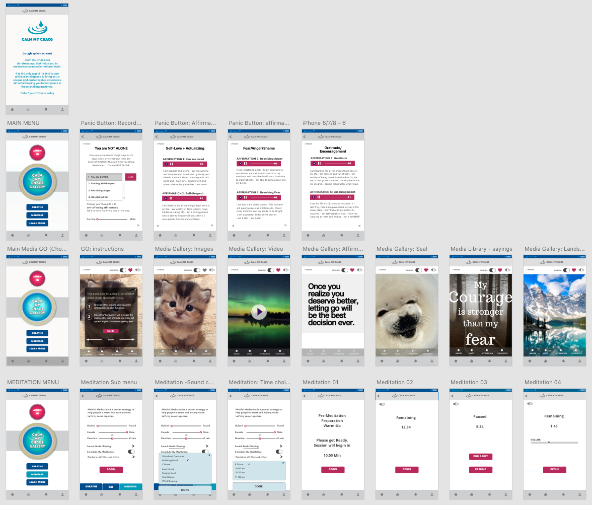
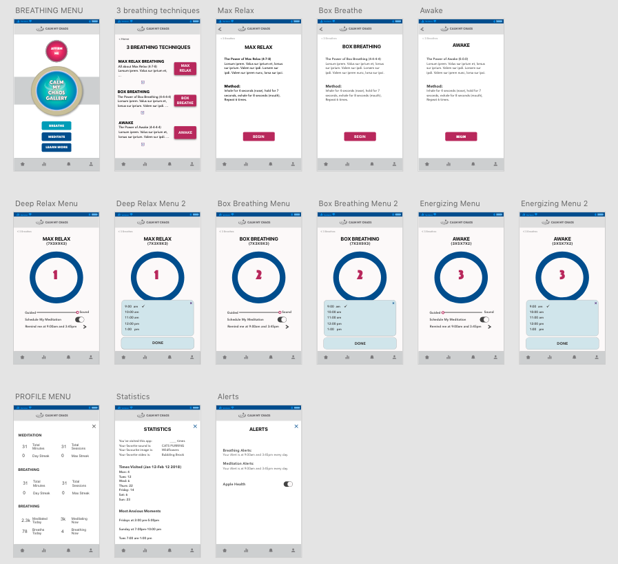
10.0 THE FINALE: (User Testing and Final Prototype)
Here are the final screens for the Calm My Chaos product.
In a user test where I provided general users with specific tasks, they responded favourably to the new changes and found the interactive mechanics both intuitive and easy to use. I was relieved that the innovative parts of the app worked well and am looking forward to putting this product through further testing and eventually into production.
Some of the components that stood out in my second round of use testing include:
1) Creating a viable on-boarding procedure introducing animated parts of the app. (instructional)
2) A mood feature to explain what/how one is feeling
3) An accompanying website offering education models.
Some comments of the user test can be seen here in the actual prototype:
Here is the actual prototype:
11.0 Summary
The task of creating anything worthwhile takes time and hard work, and most especially the ability to let go of the end product. I've created a vision of an app that I hope will find funding however what is important is not so much the idea of an app but the impetus to create something with the right integrity and intention. Calm my Chaos will likely go through many iterations depending on what my UX research uncovers. I look forward to developing a project that I hope will be helpful yet completely platform agnostic.